South America travel pictures can lose their impact when they are squeezed into identical grids. These 7 page concepts show which photos to feature, what mistake to avoid, and how to make each landscape, city, or wildlife subject feel distinct.
The difference often comes down to scale, not decoration. A misty stone ridge, a stripe of rust-red mountain, or a sun-bleached dune already carries enough feeling, and too many stickers or tiny prints can flatten it. A narrow caption strip, torn kraft paper, or one faded ticket can hold the memory without blocking the light and texture that made you take the photo in the first place.
1. Build a Machu Picchu Hero Page
Got one Machu Picchu shot you love, but no idea how to give it enough space? Start there, because this image usually works best when it leads the page instead of sharing attention with six smaller views.
Let the landmark breathe
Print the photo close to full page, or leave only a slim white border around it. The soft gray stone, deep green terraces, and pale morning haze already create layers, so you don’t need much else. Make scale the main design choice. If the landmark gets shrunk under stickers, title blocks, and extra snapshots, the whole page feels less memorable.
Keep words narrow and low
Use one caption strip across the bottom or along one side, about the width of two fingers. A matte paper strip works better than a glossy block because it won’t fight the photo. Add the place name, date, or one short note, then stop. Save the llama close-up or train photo for another spread so this page stays clear and calm.
Printing those expansive vistas right at home becomes much simpler using the Liene M100 4×6'' Photo Printer Bundle for crisp results.


Photo by Ángel Monteza on Pexels
2. Pull Swatches From Palcoyo
This idea suits scrapbookers who love color and don’t want another standard mountain page. Skip it if your best image is weak or blurry, because the photo still needs clear ridge lines to guide the palette.
Palcoyo works well because the mountain already gives you a ready-made set of tones. Instead of printing one large photo and leaving it at that, pull paper swatches from the ridges: rust, dusty gold, muted green, and a soft violet-brown. Cut them into uneven bands or small layered tabs. That feels closer to the land itself than a bright rainbow theme that looks store-bought.
Keep the photo medium-sized, not huge, so the color work has room to speak. A torn edge on the paper helps, especially with textured cardstock that catches light like dry earth. Place the swatches beside or below the picture, not over it. This is where color matching matters most. If your papers are too bright, they can make the mountain look fake, and Palcoyo’s appeal comes from its dusty, natural shifts in tone.
One more detail helps. Leave a little space between layers so each shade reads on its own, the way the ridges do from a distance. A clean cream background keeps the page from turning muddy.

Photo by Jose Galarza on Pexels
3. Add Desert Texture Without Clutter
Your dune photo can look flat fast.
Huacachina and the Atacama Desert both have strong shapes, but many scrapbook pages bury those clean lines under too much texture. Use materials that echo dry sand and wind-cut slopes, then keep them sparse so the horizon still feels open.
What to add, what to skip
- Kraft paper: Tear one edge for a rough dune line under the photo.
- Sand-colored cardstock: Layer it behind the print for a soft, warm base.
- Sparse stitching: Add a few straight lines to hint at wind trails or tracks.
- Loose sand: Skip it, because it can scratch prints and make the page messy.
Try a photo taken near late-day light, when the dunes turn honey gold and the shadows go cool brown. Keep the rest of the page quiet, with wide margins and only one small caption, so the desert still feels big.
Laying down a solid foundation for those ripped dune edges works wonderfully with 20 Sheets Brown Kraft Cardstock.
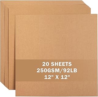

Photo by Mateusz Walendzik on Pexels
4. Layer Buenos Aires Street Ephemera
A 3-by-4-inch transit ticket, a cream café receipt, and a strip of painted color from Caminito can give one city page real character. The trick is to stop at three pieces, so the photo still reads first.
Buenos Aires images often carry a lot of energy on their own: bold walls, worn pavement, metal railings, and hand-painted signs. A street shot from Caminito works especially well with paper scraps that feel used and local. Tuck the pieces around one edge of the picture instead of framing every side. That keeps the layout readable on a quick glance.
Build one lived-in corner
Cluster your extras in one area, such as the lower left, and overlap them by a small amount. A handwritten label on plain cardstock can tie the pieces together without stealing focus. Use ephemera to support the mood, not to prove you saved every scrap from the trip. If one item is brightly colored, let the other two stay neutral so the page still feels balanced.

Photo by Guilherme Ramos on Unsplash
5. Make a Galápagos Field Guide
Use the same crop on every wildlife photo first. That one choice keeps the page calm, so your Galápagos spread feels like a real field guide instead of a pile of mixed snapshots.
Pick a simple grid with square or near-square frames. Leave a small line under each image for a place name, animal name, or short note from the day.
- Marine iguanas: Choose a side view or resting pose, so the shape reads fast on the page.
- Tortoises: Use one photo with lots of shell detail and one clear background.
- Blue-footed boobies: Keep the feet visible, since that color is part of the memory.
Stick to one border color, such as sand or deep blue, and avoid mixing tall and wide prints on the same spread.
Clipping your wildlife shots into uniform shapes takes mere seconds with the BearBoss 2.12 Inch Square Punch.


Photo by Diego F. Parra on Pexels
6. Stretch Landscapes Across a Panorama
A wide landscape often gets chopped into one small print, and the scale disappears. A better move is to join two facing pages and let the view run across both sides, especially for the Sacred Valley or Patagonia.
Set the Horizon First
Before you trim anything, line up the horizon across the spread. If the mountain ridge dips on one side or the river jumps upward, the page will feel off right away. Print a test on plain paper, fold it at the center, and check where the seam lands. Keep people, llamas, and other face-level details away from that fold, since the crease can split the photo in an awkward spot.
Choose One Wide View or Three Frames
A single panorama gives you drama and space. It works well for layered hills, long valleys, and open sky. A three-frame sequence feels more paced and can show a path, then a closer ridge, then a final detail like terraces or ice.
Use one style per spread. Add a slim caption strip at the bottom, not over the sky, so the scene stays open and easy to take in.

Photo by Seiji Seiji on Unsplash
7. Sequence Amazon or Iguazú Action
Most travel pages pick one favorite shot and stop there. Action scenes work better as a sequence, because an Amazon boat ride or the walk toward Iguazú Falls has movement, spray, and changing viewpoints that one frame can’t hold.
Place three to five photos in reading order from left to right. Start with a wide scene, then show motion, then end on a close detail, such as mist lifting off Iguazú, water breaking against the boat, or hands wrapped around the rail. Keep the spacing even so the eye moves across the page without getting stuck.
The sequence should feel like a short film strip. If two photos repeat the same angle, cut one so the page keeps shifting from overlook to path, or from open river to rail-side detail.
Mounting consecutive action shots neatly in a row is effortless using the Scotch Double Sided Adhesive Roller Tape Runner.
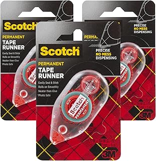

Photo by Marina Zvada on Pexels
Where to Start First
The panorama spread is the right start when your strongest photos are wide valley, mountain, or coastline views, because it teaches spacing, trimming, and where the eye lands. Try that one on plain paper before you print the final photos so you catch center-fold problems early.
Choose the Galápagos grid when you have many animal shots that need order and equal space. Pick the panorama when one long landscape matters more than small details. Choose the Amazon or Iguazú sequence when your photos change viewpoint from frame to frame and the story depends on motion, spray, or the boat rail drawing the eye forward.
Read next: 7 South America Travel Landscape Spots for Photos


